WOFF font rendering issue on Windows, fixed
30th July 2018
We recently posted about the font loading solution we use on our websites. Further to implementing this technique we noticed that, on this very site, some of the fonts weren’t quite rendering correctly.
Look at the examples below. The font rendering issues were slight but there was a definite problem with uneven character weighting in the Google fonts we were using (Noto Sans and Cabin).
It’s particularly noticeable on the crossbars of the capital Hs but you can also see that some of the ascenders are too bold. Capital Ss also show problems where their terminals on the cap line are bolder than their finials on the base line. There is a similar issue with the bold lower case C. Finally, the apices of the lower case Ts aren’t really rendering at all!
(Also note that the rendering issues are only obvious in the first paragraph of text and in the bold title. The second paragraph of text appears to be rendering correctly.)
Tying down what was causing this proved tricky for the following reasons:
- The problems are only apparent on Windows machines
- The problems are more apparent in IE than Chrome
- The problems are only apparent with certain font families
- The problems are only apparent at certain font size/weight combinations
So, to get to the bottom of this we needed to unpick our font loading solution… We use Font Squirrel’s Webfont Generator to generate compressed WOFF and WOFF2 files from the original TTFs.
The generator offers three modes: Basic, Optimal, Expert. We’d entrusted it to ‘Optimal’ and it transpires that this was causing our problems.
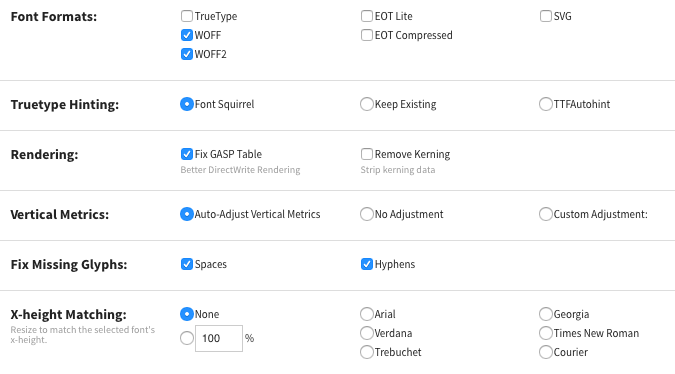
Font Squirrel’s ‘Expert’ mode allows you to adjust a whole host of settings. (See below for a subset of these.)
It turns out that the culprit in this instance is Font Squirrel’s Truetype Hinting algorithm. Font hinting is a complicated matter, the nuances of which are beyond the scope of this post, however, suffice to say that automating the hinting process via the default ‘Font Squirrel’ setting proved problematic.
When we set Truetype Hinting to ‘Keep Existing’ or ‘TTFAutohint’ our problems vanished.
It’s worth noting that we’ve not seen this issue on any other projects so this setting must only affect certain fonts negatively. However, as a bonus, this change also involves a file size saving for the variants of Noto Sans our website uses. See the comparison below:

Noto Sans font file size comparisons with different hinting options (‘Font Squirrel’ on the left, ‘Keep Existing’ on the right)
As such we’ve now added a config file which includes this change ("tt_instructor": "keep") to our boilerplate repo.
Moral of the story – leave font hinting to the font designer!
Got an idea for a project?
Need a website? Web-enabled software to streamline your business? Just some advice? A hug?


