Project planning with site maps and user flow diagrams
30th May 2018
We’re in the early days of planning out a web design-and-build project with a new client. A key part of this process is the creation of a site map.
The Site Map
In its simplest form, a site map is a pictorial representation of the pages required of a website. With smaller websites this list of pages is easy to define and it’s not much more of a stretch to group them into a sensible order.
With larger web projects this task can be much more involved and producing a sensible site map relies on a host of other disciplines (like information architecture and user experience design) but the requirements of the job at hand fall mostly into the former camp.
It’s worth demonstrating that a sensible site map doesn’t merely need to show a breakdown of a website’s pages. Instead it should also show how they fit together, where multiple pages might be grouped via dynamic data sources and what kind of elements might be common to every page.
The trick is fitting all of this information into a straight forward infographic that stakeholders can immediately understand (and preferably print).
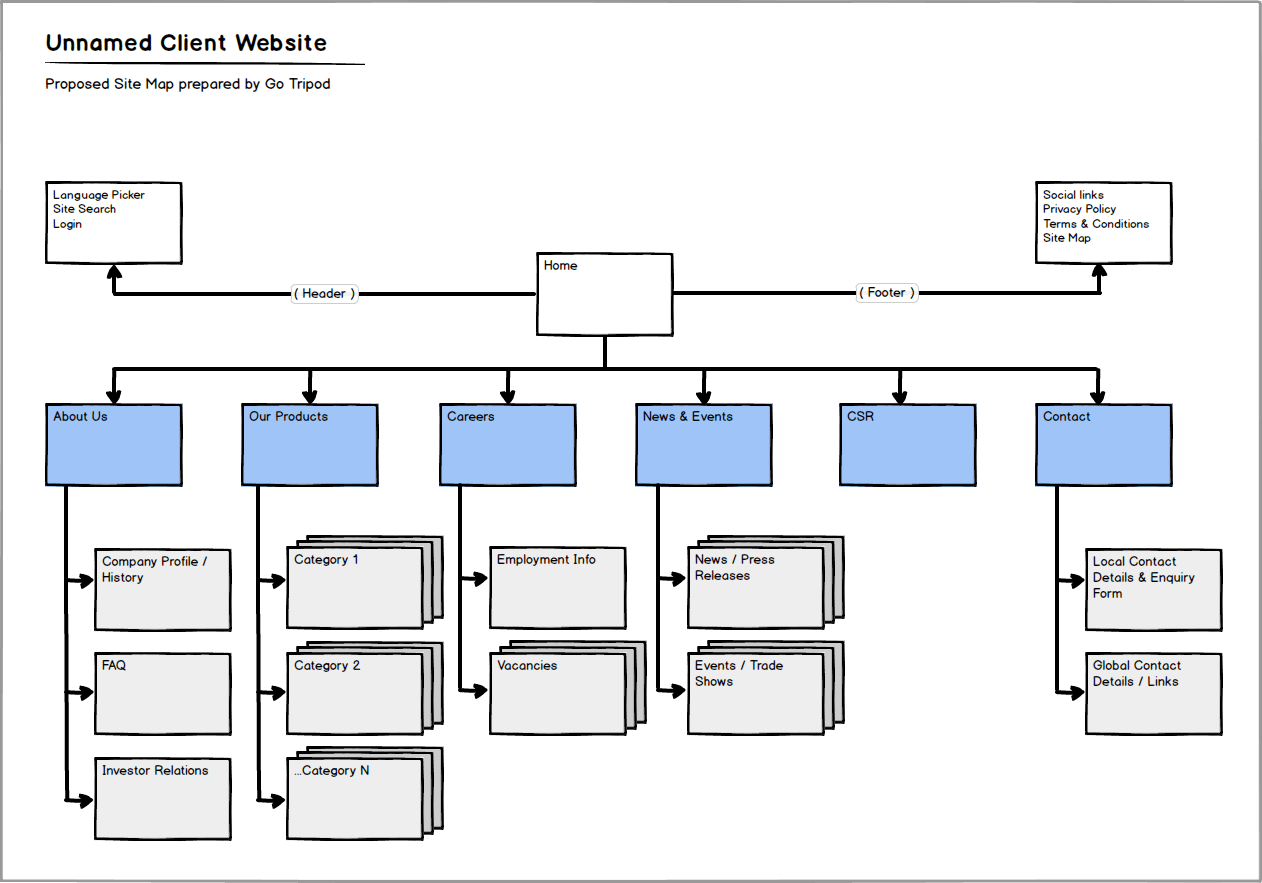
Enter our case in point (click to expand):

Note that I have used the homepage to define the site-wide header and footer information as well as the main navigation options. It is clear each navigation option represents a top tier page and it is immediately obvious which option includes additional features, pages or sub-sections.
(Strictly speaking the header and footer should be represented on every page, rather than the homepage alone, but to harness the power of an infographic one must expect some inferral ability on the part of our audience.)
The User Flow Diagram
User flow diagrams differ somewhat from site maps in so far as they attempt to demonstrate how a user interacts with a website rather than how the website’s contents are hierarchically broken down.
Naturally there is some crossover between these two approaches and again the complexity of a user flow diagram will depend on the complexity of the website (or process) concerned.
One way to think of these things is that whilst both diagrams might utilise boxes and arrows, the user flow diagram is more likely to take the shape of a flow chart.
With our current project, there was a loosely defined need for a restricted client area that would allow logged in users to access (mostly product based) information unavailable to regular visitors.
Whereas our client had been quite clear about what content was required of the front-end, defining this ‘restricted area’ proved much more elusive. Instead we were given a long list of bullet point thoughts and ideas regarding things they might like.
As it happens, attempting to formalise these loosely defined requirements suits the user flow approach better than the site map approach.
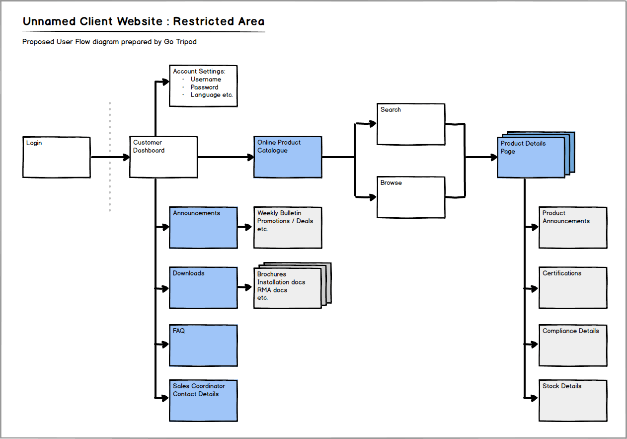
And here is the case in point (click to expand):

Note that this diagram demonstrates how a user might interact with the website and that the flow, in this instance, is shown from left to right.
Starting with the login process, the customer has a number of options; accessing important information available from their dashboard, amending their account details, or drilling down into specific product information.
Again, stakeholders can immediately make sense of what’s been proposed. This diagram should, after all, reflect a sensible interpretation of the client’s hastily compiled requirement list.
But also, importantly, it serves as an early conceptual blueprint that encourages client feedback. The flow diagram, once finalised, will additionally help formalise the development process.
In conclusion – a collection of carefully thought out infographics can serve as a powerful tool in terms of both defining a new project and improving an existing website or set of software processes.
Got an idea for a project?
Need a website? Web-enabled software to streamline your business? Just some advice? A hug?

